CATEGORY
Brand Redesign
MY ROLE
I was hired as the sole designer on the Marketing team at Boost to lead and execute a total brand redesign. The mission was to take Boosts ‘old school’ branding which was not memorable and did not reflect a bold/tech-forward identity and turn it into a modern, bold sophisticated look with a focus on usability, first impressions and conversions.
CASE STUDY
PROJECT SCOPE
The redesign project was set to include the following:

• Completed brand guidelines, including logo development, completely reimagined look and feel, and color scheme
• New, simple messaging across all platforms, written by content marketers
• New website design and development to showcase new design and messaging
• All company collateral updated to the new brand, which included: website, all existing marketing materials, swag, social media presence, office signage and theming, sales documents and advertisements.
ABOUT
Boost is a insurance infrastructure-as-a-service in that is licensed to develop and sell P&C insurance products in all 50 states based in New York City. The modern, bold shape used in the logo was designed to show the complex layers that are behind Boost's API in the way the user will access them - simply and cleanly. The use of gradient coloring in Boost's brand was intentional - to make it visually memorable and stand out in the market.
STRATEGIC SOLUTION
After extensive research, I presented visual ideas that differed from competitor brands:

• Bold, bright accent colors
• Striking visuals that show a tech-forward identity
• Less words, using more simple diagrams to help users easily digest insurance terminology

I had one-on-one calls where the VP of Marketing and technical teams walked me through every detail of Boost’s platform, so I could create
graphics that showed every complex detail in a simplistic way. Forming a deep understanding of Boost’s technical product and processes was the
key to a new, bold, simple (but informative) design coming to life.
OUTCOME
The brand redesign resulted in overwhelming client satisfaction and a boost in overall sales. Using Google Analytics, we were able to note a 30% increase in customers who stayed on our website than the previous design.

To ensure the new brand was cohesive and easily spread throughout the company, I used a Notion wiki page. I organized a Marketing depository that housed Google Drive links to all updated branded content, such as EPS and PNG logo files, letterheads, Google Slides templates, messaging guide, sales documents, and more. Any new branded item that a Boost employee would need all lived in this depository.
STAKEHOLDER FEEDBACK
Approaching launch, Boost’s CEO said the following:

“Phenomenal work on these massive rebrand and website projects. I’m so happy with how everything turned out and I wanted to thank you for putting so much time and effort into it all over the last few months. It’s so amazing to see how far we’ve come as a brand and as a company, and we owe it all to people like you who make it happen.”
Expertise with Marketing design at Boost, B2B Startup:
• eBook and Handbook Design • Informational One-sheet Design • LinkedIn / X / Facebook Ads • Social media posts and videos • 
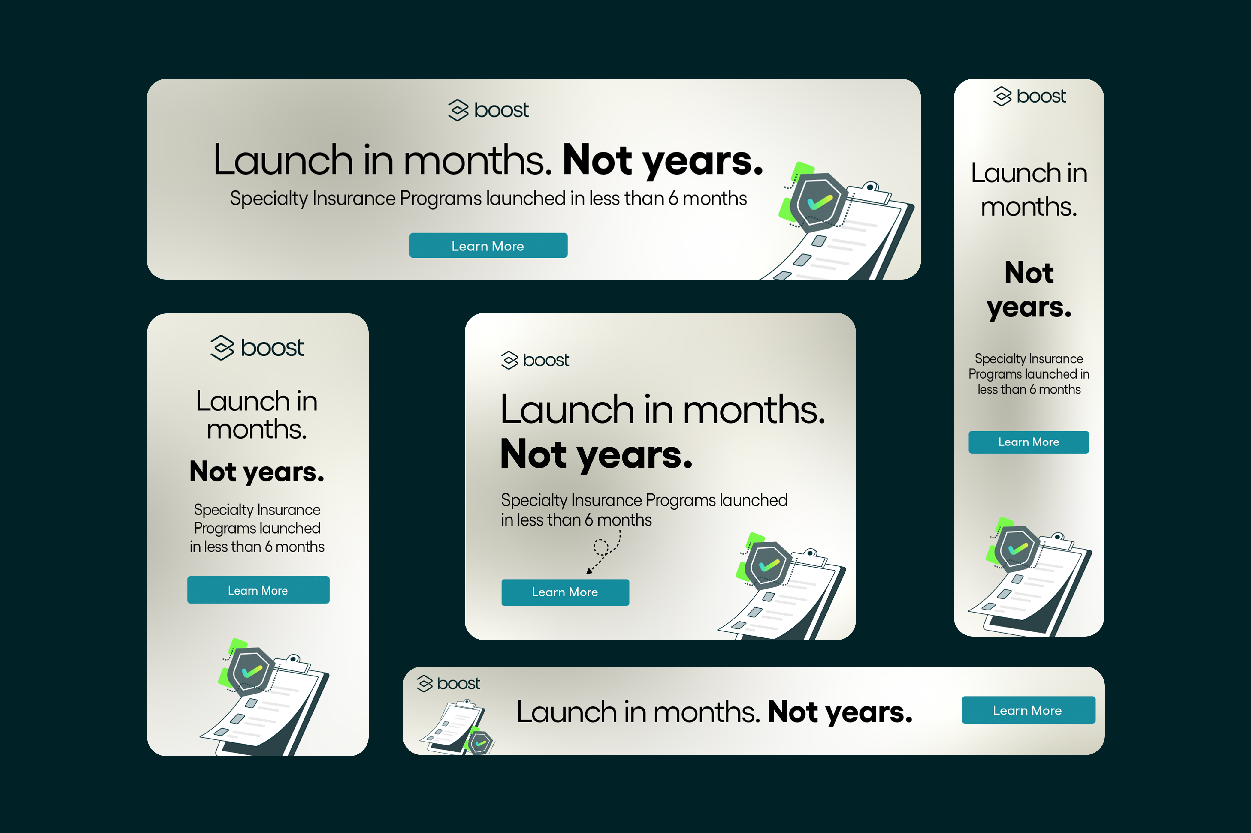
Google Ads (Responsive designs for all sizes requested) • Google Slides / PowerPoint templates • Sales pitch decks and board decks • Stylizing graphs and charts using data in Google Sheets/Excel • All customer facing documentsAll internal documents and company materials • Business cards • Tradeshow Booth designs• Website design • Landing pages using Hubspot or Webflow • Case Studies• Infographics • Converting EPS and AI files into editable vector images for use in Google Slides • Conference documents and tradeshow items • HTML Email newsletters • Illustration and custom icon building • Sales proposals