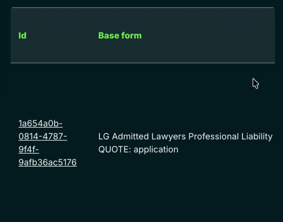
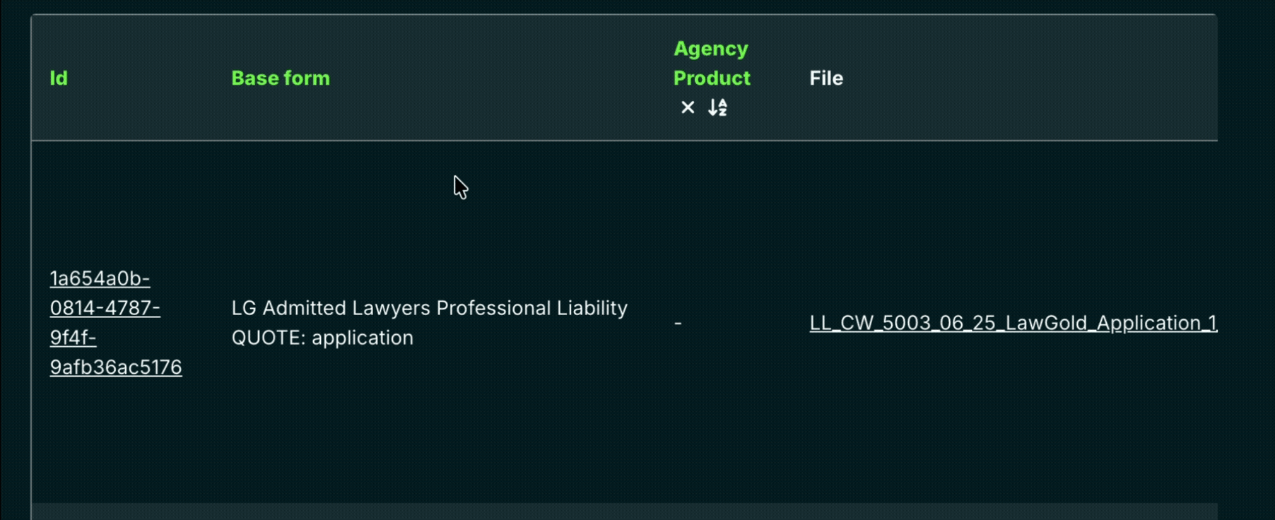
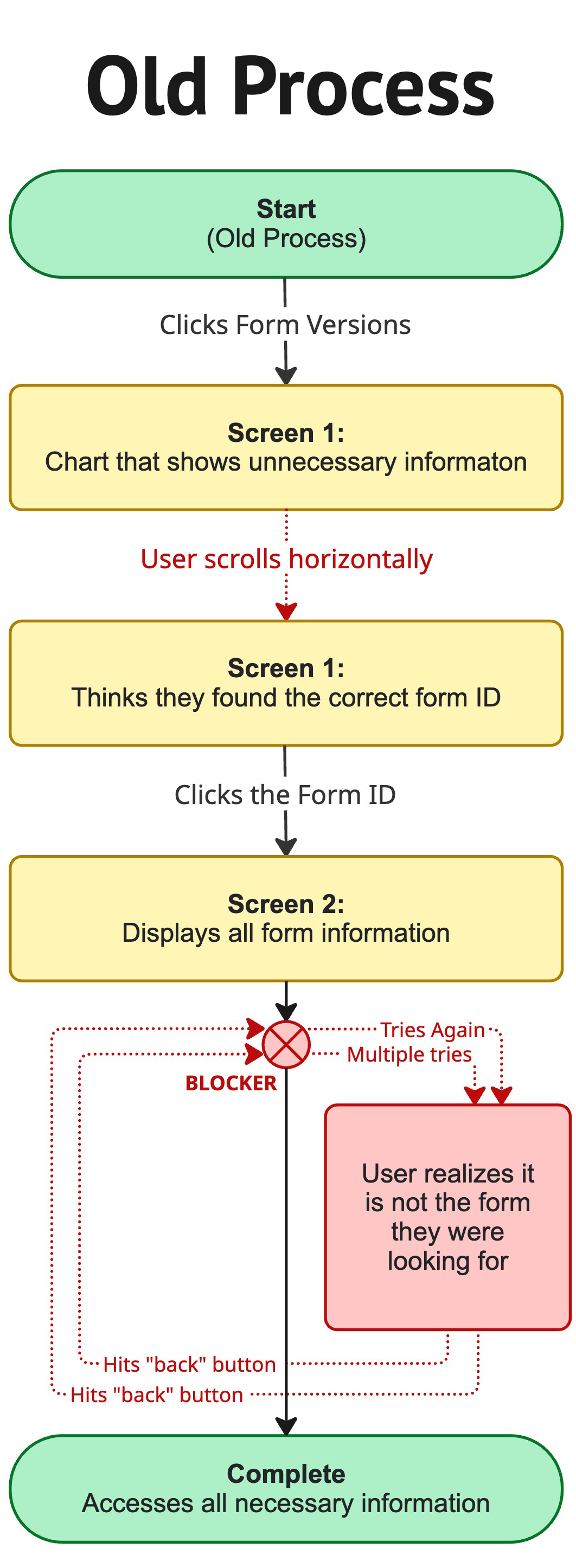
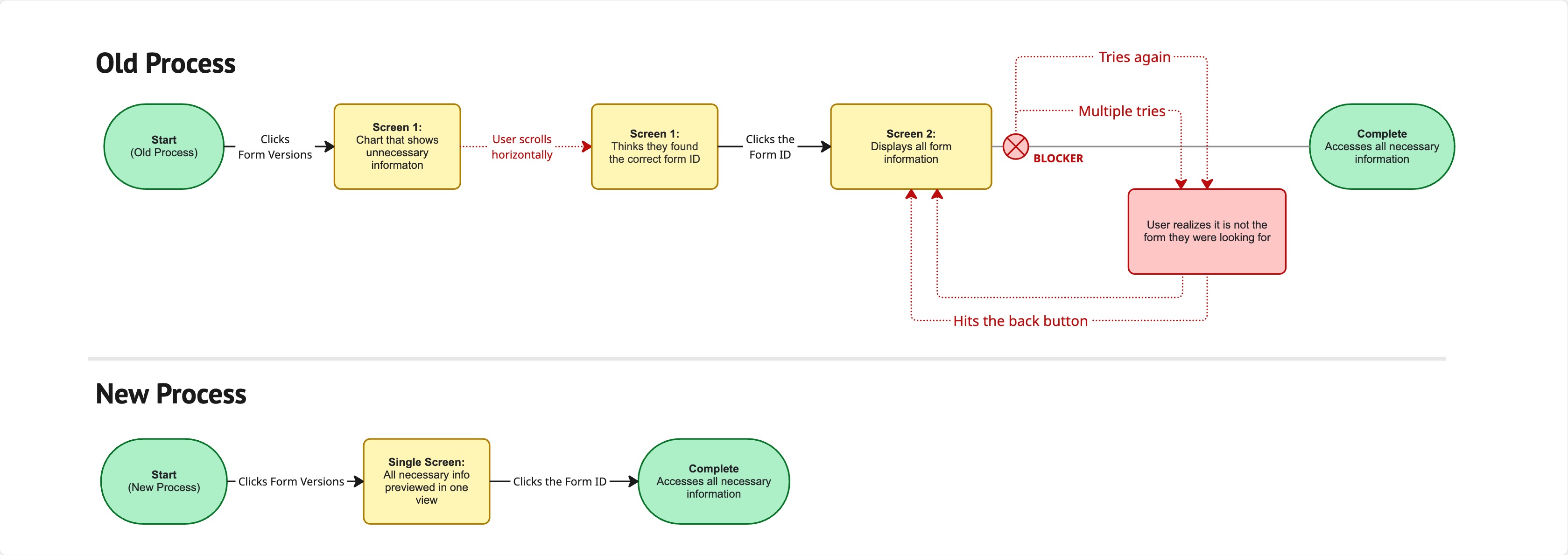
In Boost’s Program Manager tool, underwriters struggled to quickly identify the active version of a form. Accessing this information required navigating a tedious, disorganized flow, and the details were not clearly displayed.
Solution
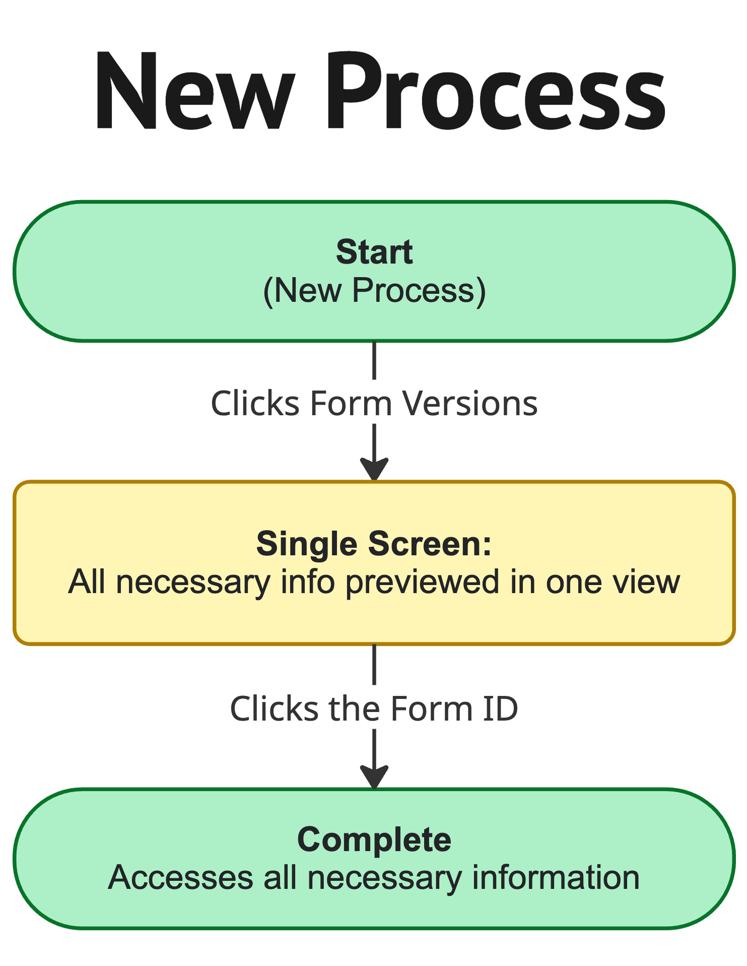
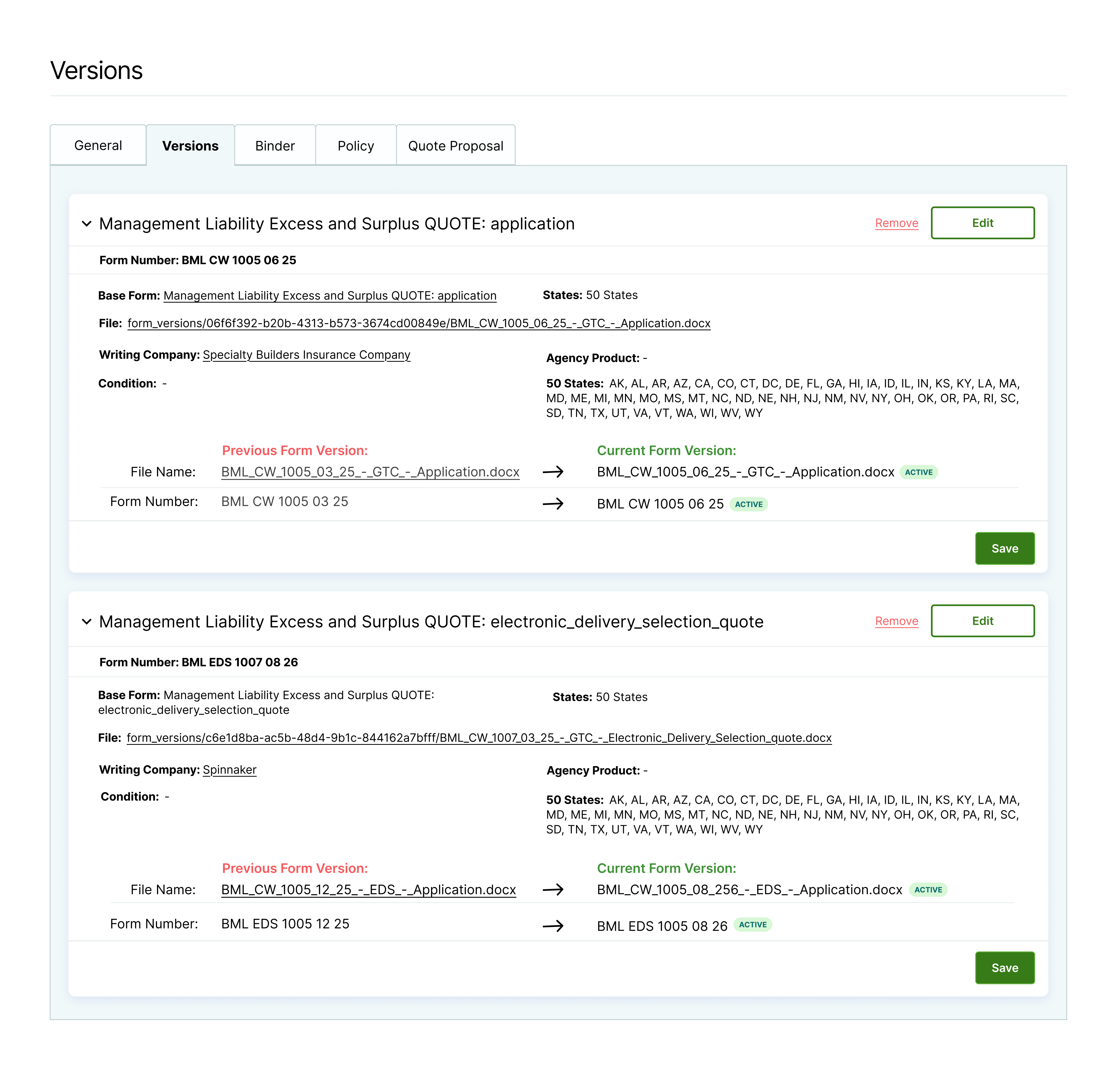
Create a simplified user flow using collapsible cards that organizes and displays key information clearly. Designed the process using Django-compatible patterns and components.
User Persona
Underwriters. Because underwriters must make high-volume decisions quickly, Boost wanted to optimize the Program Manager tool to surface critical information at a glance and enable faster, more confident decision-making.
Pain Points
• The current layout relies on horizontal scrolling, reducing information visibility. • Repeated use of the “Back” action slows users when searching for information. • Through user testing, I identified that low-value fields were overly prominent, and users had no clear way to identify the active version.
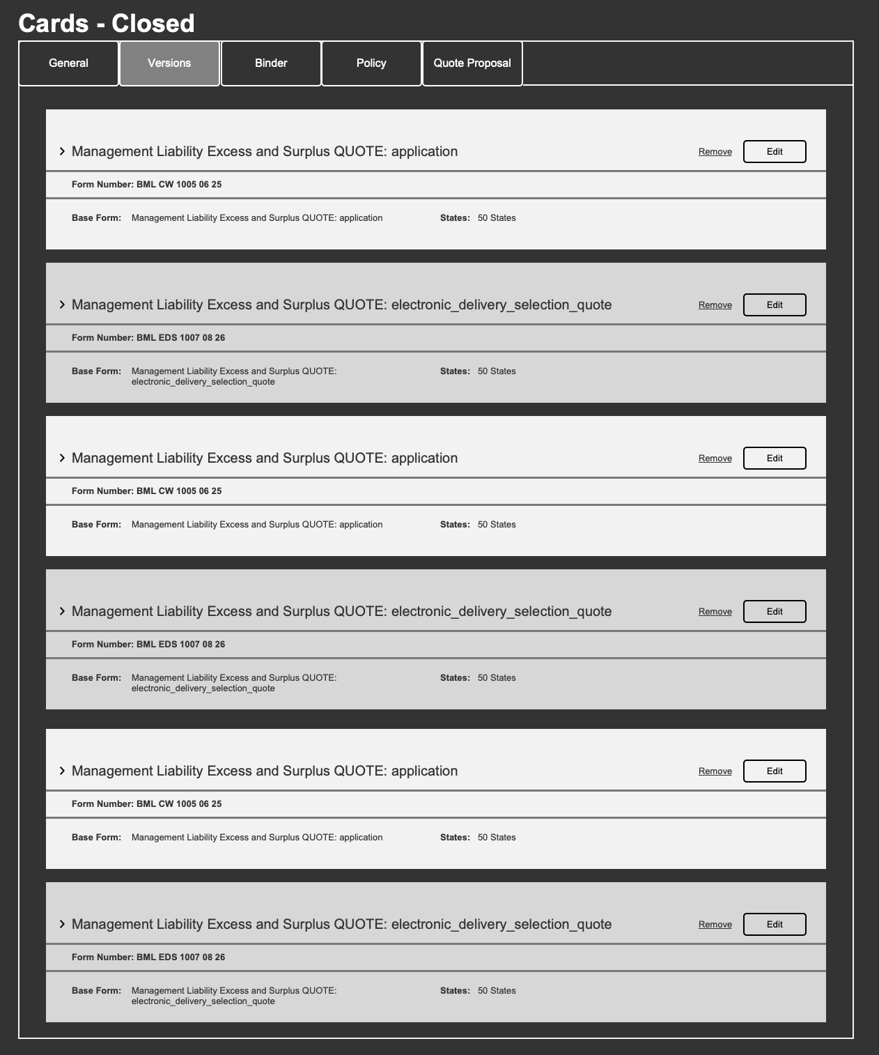
Low Fidelity Wireframes
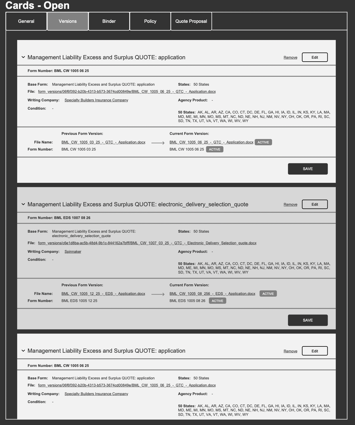
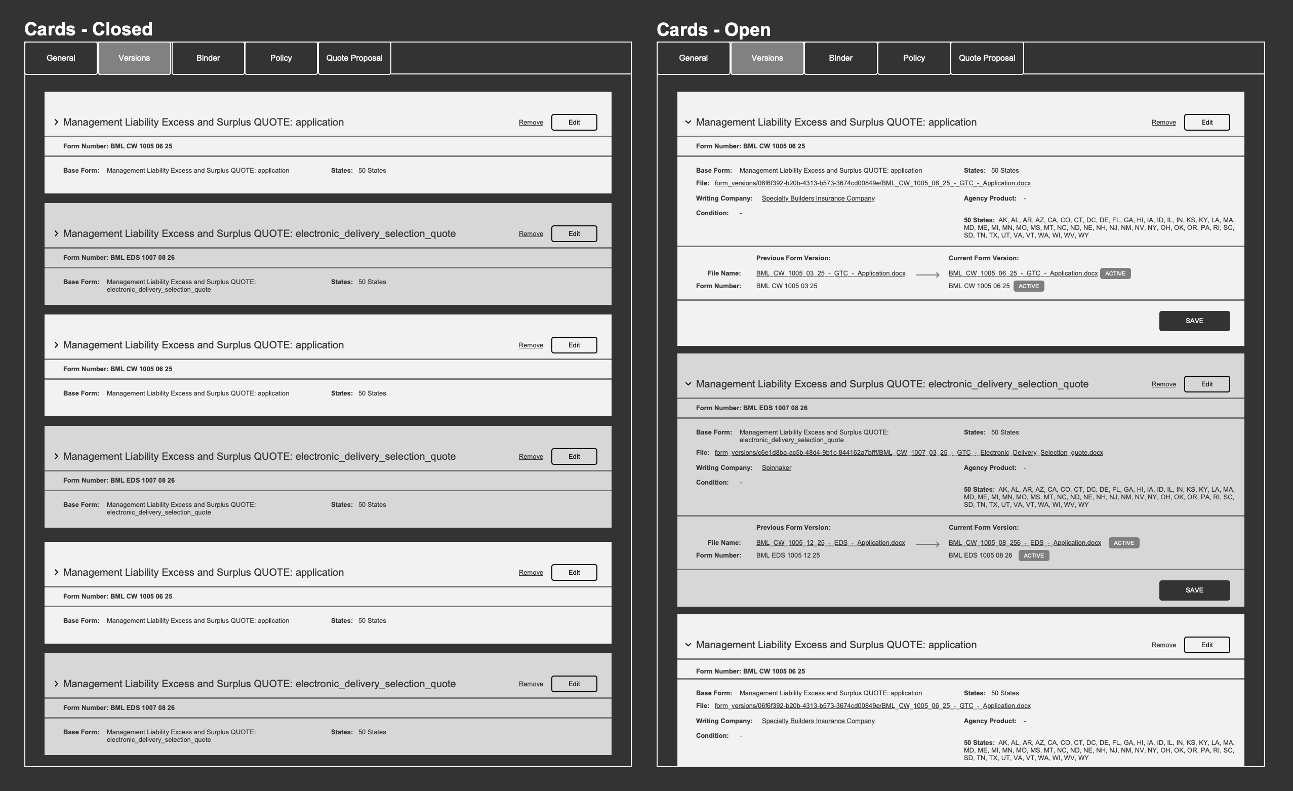
Cards surface essential information by default and expand on interaction to reveal secondary details.
UI Improvements
To reduce cognitive load and improve usability, low-value content was removed and horizontal scrolling was replaced with expandable cards. Each card highlights essential information upfront, with progressive disclosure for additional details.
User Testing
I encourage users to freely explore the designs during feedback sessions, which helps reveal points of confusion, friction, and moments of delight.
Feedback Loop
• Is all the necessary information on screen? • Is all the necessary information removed from the screen?
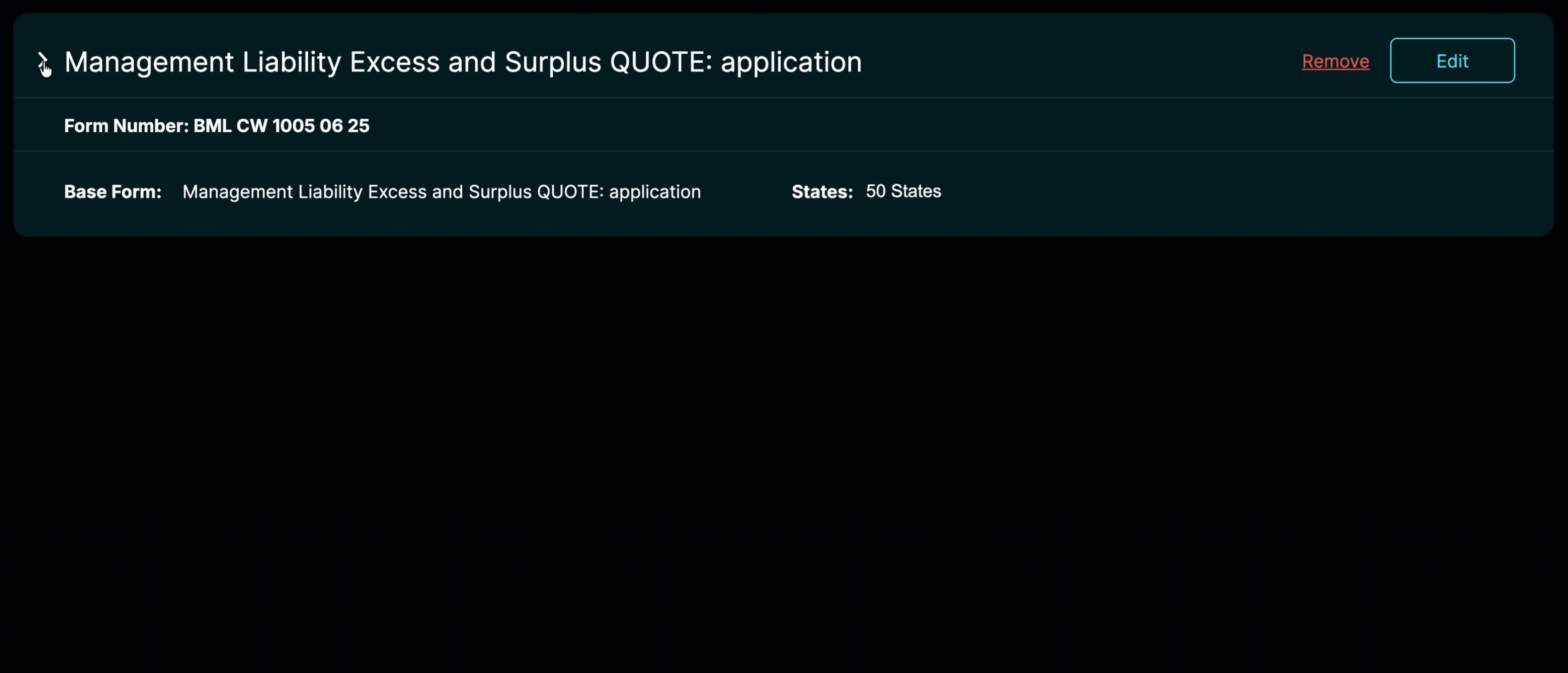
Light and Dark mode
A light-mode version of the UI was designed to minimize eye strain and improve long-term usability.
Usability Feedback & Team Results
The feature received strong positive feedback from underwriters. They expressed that having a clear, organized, and confusion free workflow allowed them to work 2× faster. The design minimized cognitive effort and decision friction.
2X Faster Underwriting Workflow
Project Summary
This project covers the full UX lifecycle—from problem definition and research to interaction design and visual execution—resulting in a streamlined interface that balances complex data needs with clarity, efficiency, and usability. By simplifying complex workflows, the redesign meaningfully improved users’ daily experience—reducing stress and enabling them to work with greater ease and confidence.